Designing the Site
Audience and Purpose
The first step in the creation of any site is to determine an information architecture. To do that, I had to answer a few basic questions:
- What information will be on the site, and what structures does it already have?
- Who are the audiences, and what are their purposes?
- What is the scope of the site?
These questions, though simple, really set the angle of my approach to the project. The information, in this case, was the contents of the magazine, which definitely has its own inherent structures. Each work has a number of identifying factors: Type of work (artwork, poem, short story), author, and edition it was published in.
I also determined that there were three distinct audiences for the site: Students & Alumni, Stakeholders, and Randoms. Ideally, I would have then done some preliminary user research, to figure out what these audiences were looking for. However, as I was doing this project alone for a high school club, such research would have been far too excessive and time consuming to be warranted based on the benefits. Instead, I took my best guess. The students and alumni would be on the site primarily to find their own works and the the works of their friends. Stakeholders, such as school administrators and parents, want to be able to see the tangible results of the Writers Club. Randoms, defined as people with no real connection to the magazine, will primarily be looking for an assorted selection of what the site has to offer.
This lead me to determine two main functions of the site from a users:
- Visitors must be able to find works be particular works and authors.
- Visitors must be able to easily browse a selection of works without having any particular work or author in mind.
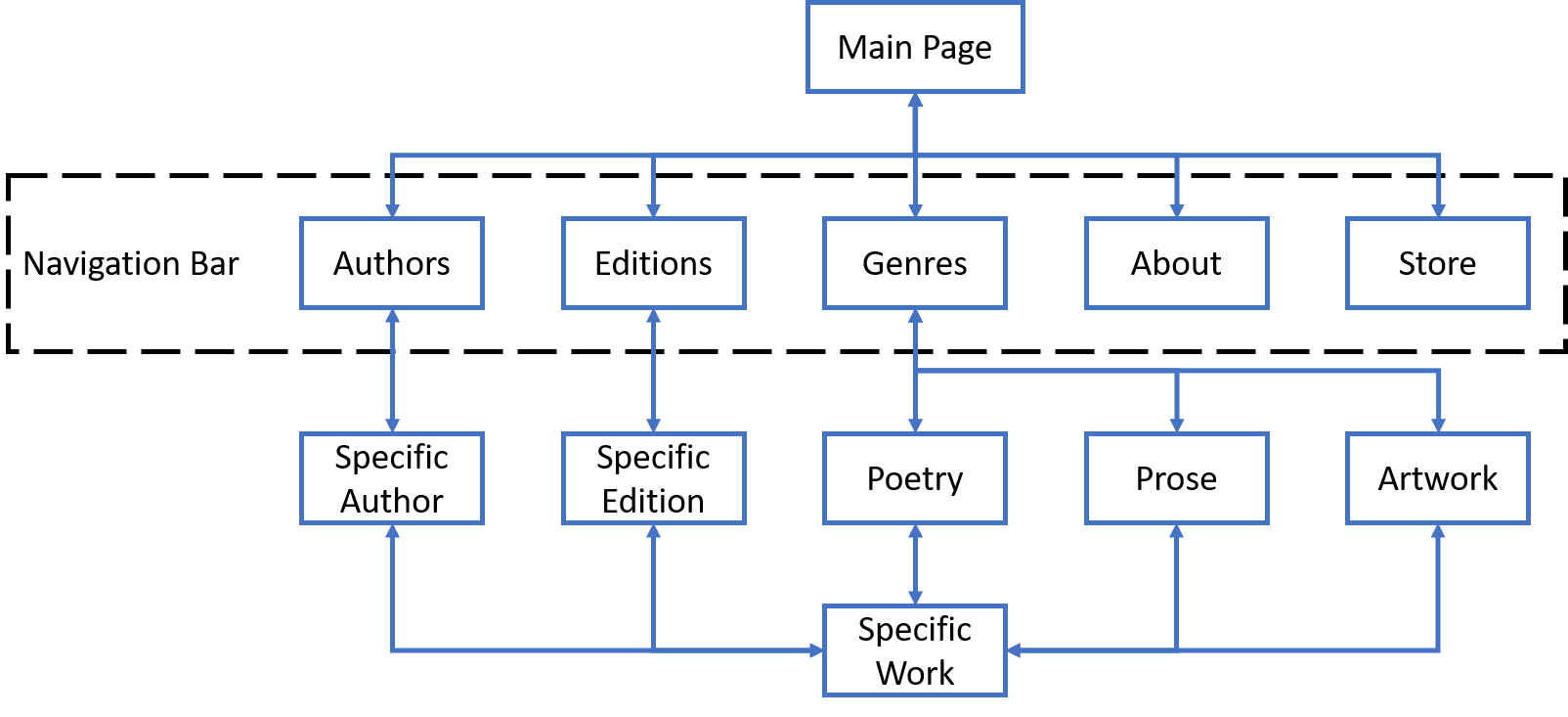
Based on this, I decided that the information architecture should be based around a search and set of taxonomies. The search would allow visitors who know what they are looking for to find it with minimal fuss. The taxonomies, which would be based around the types, authors, and editions that I identified as structures inherent to the information, would provide some structures through which visitors could browse if visiting the site without having a specific goal in mind.
Information Architecture
Site Map

